Process Work
Analysis & Sketching

Text Analysis

An initial draft for text placement with the imagery
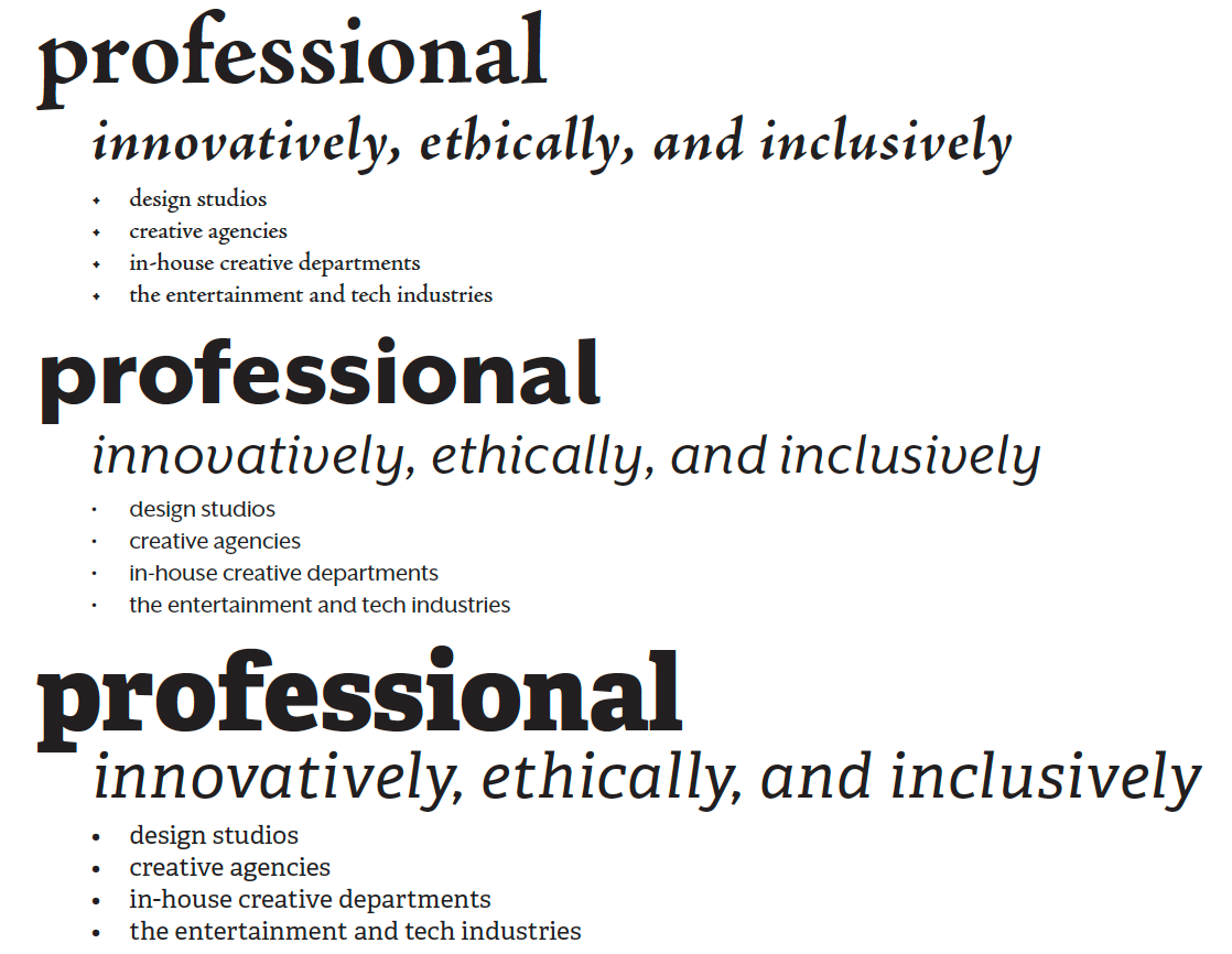
Type and Color Studies


I designed a 3 panel brochure that used all the designated text effectively. The target audience was prospective students with a goal of inspiring and informing them of the graphic design department. I started this process by analyzing the text, ultimately organizing the information into a solid beginning, during, and end, resembling a “promised Journey.” Therefore I illustrated a relatable mascot that could develop in size and color over the three panels as a prospective student, a working student, and then a big time professional. The accompanying typography mirrored these illustrations and the text by being dynamic and impactful but also open and friendly.